

Hypertea
One brand, two ways to enjoy it.
The challenge was to keep a consistent identity for a line of infusions and cold drinks with different packaging formats. We developed a graphic system that brings together logo, color, illustration and information hierarchy for boxes, individual sachets, cans and advertising. The proposal makes the brand recognizable across its formats without losing each product's personality.
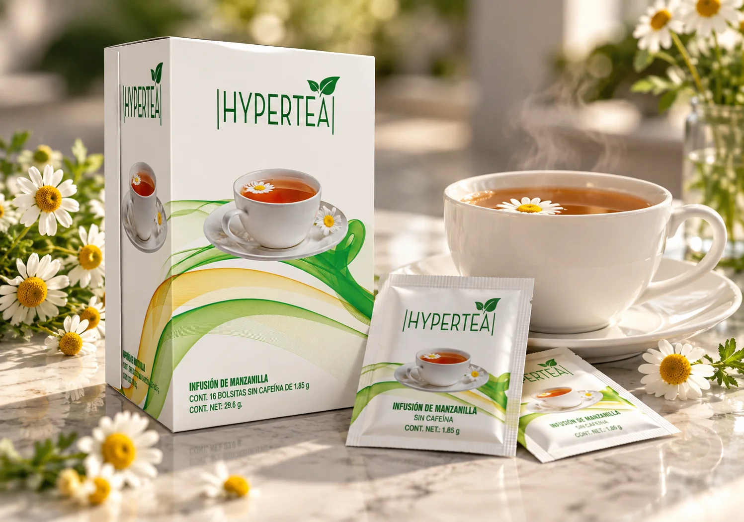
One brand for hot infusion and iced tea
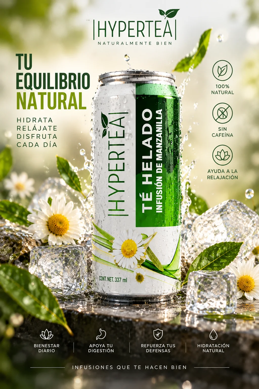
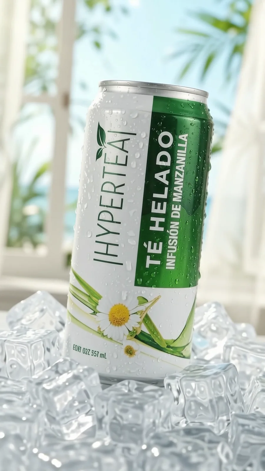
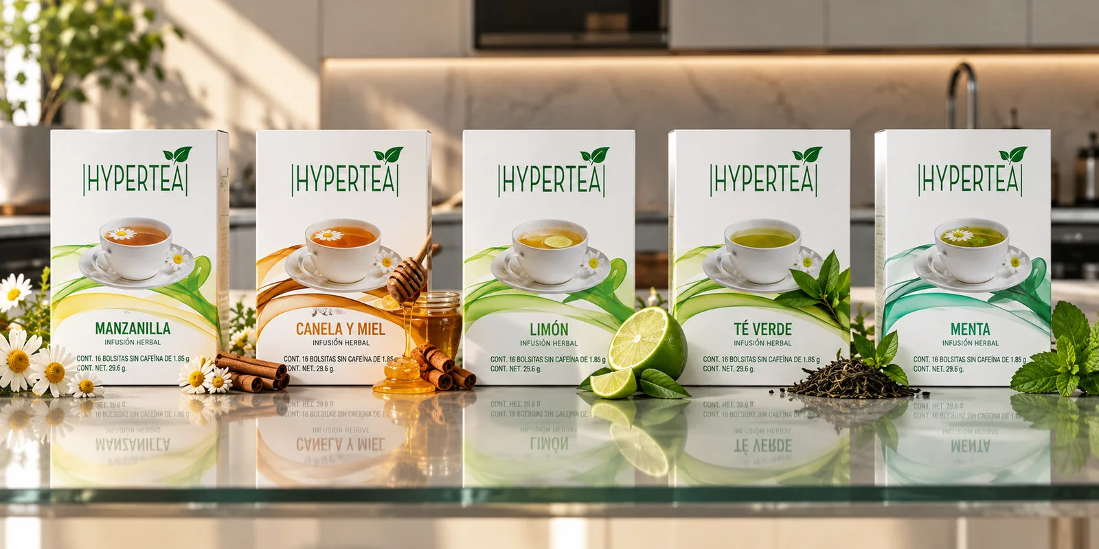
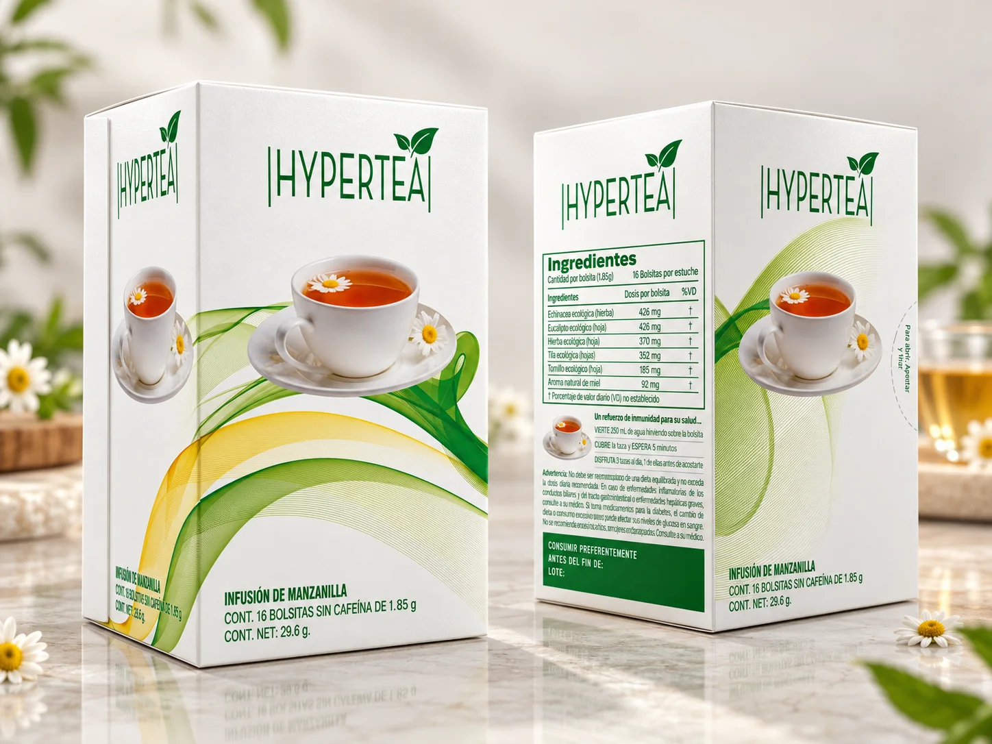
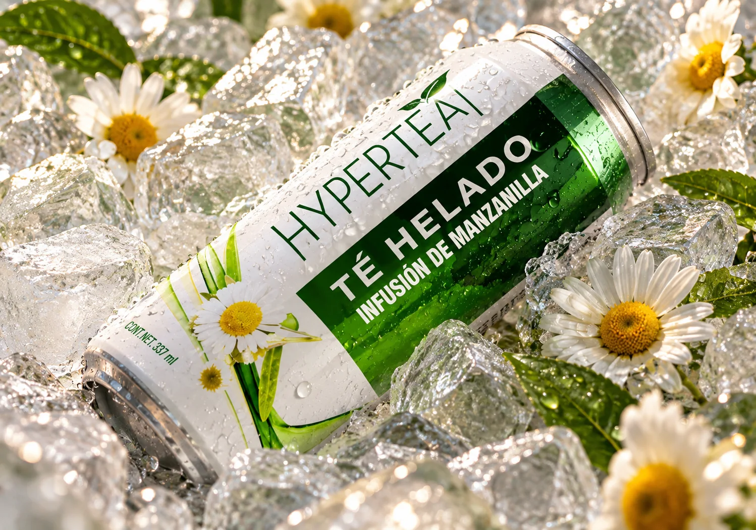
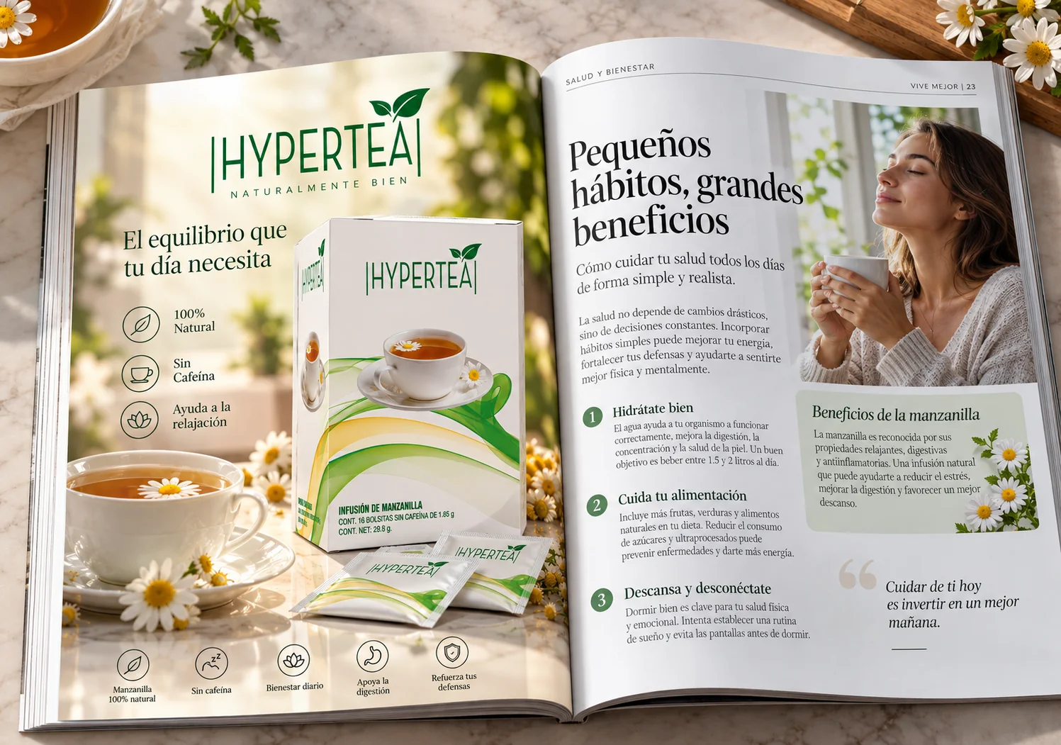
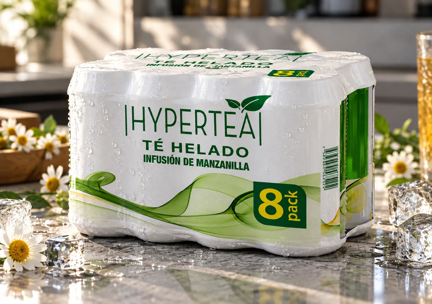
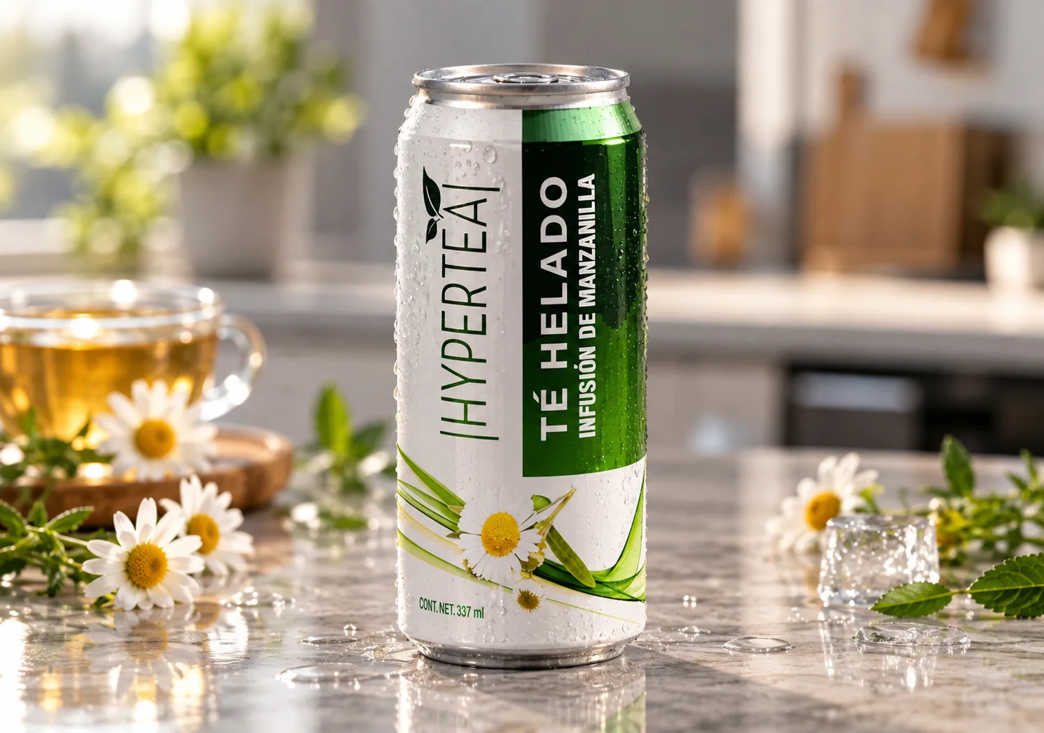
Both formats share one visual system: a white background, the green logo with its two leaves, and green and yellow waves repeated across the box, the sachets, the can and the 8-can pack. The infusion is shown with its cup and chamomile flowers; the iced tea with ice, condensation drops and a stronger green band that sets it apart on the shelf.
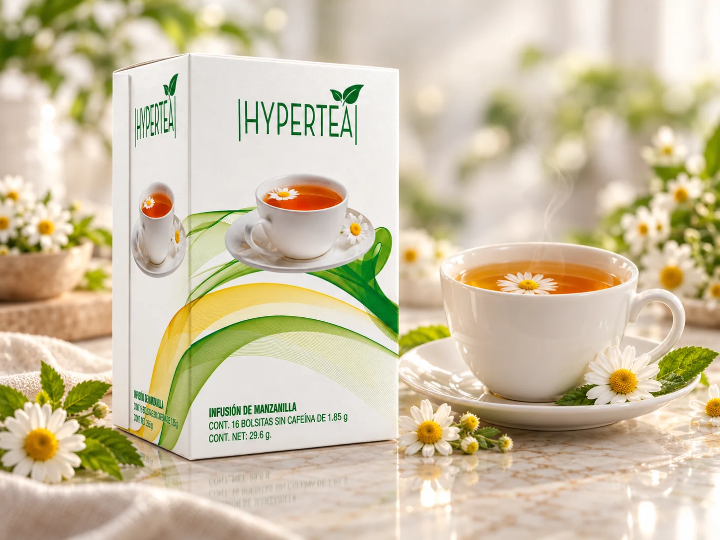


PROCESS AND DELIVERABLES
BRAND IDENTITY
Green logo with leaves and a system of green and yellow waves that ties both formats together.
INFUSIONS
16-bag box, individual sachet and a five-flavor line that keeps the same structure.
ICED TEA
337 ml can with a vertical green band and a shrink-wrapped 8-can pack.
ADVERTISING
Vertical poster for the iced tea and a full-page magazine ad for the infusion.